Creating a Great Illustration Portfolio
Tips for a great portfolio
1. The number one rule for your portfolio is to draw what you want to be paid to draw. For example, I love jungles and ocean themes, so I make sure I have both on my portfolio.
2. Have various things like backgrounds, people, places, etc., but stick to your style.
3. Editors spend very little time checking out your work and will often only look at the first few images, so make sure your best are at the top.
4. Quality over quantity, you do not need to show lots of different art styles. Keep your portfolio under 30 images.
5. Make sure your images are easy to load. I have spoken to authors and agents who have left a website simply as they didn't want to wait.
6. Keep it simple. Just a page full of images works perfectly.
7. Your portfolio is only as strong as your weakest piece, which is very important!
8. And finally, make sure your portfolio is always up to date; you never know who is looking at it.
Portfolio Checklist
Below is a checklist, try and add some of these if you are a children's book illustrator for a portfolio that sells. Again, only do pieces that feel true to you.
Children: Incorporate all ages, genders and races.
Animals: Cats and dogs are great but make sure you have a range of animals on there.
Landscapes: Cities, nature, countries
Seasons: Include different weather and times of day
People: Different cultures, ages, emotions
Character interactions: hugging, arguing, laughing, playing etc.
Actions: Running, playing, jumping, laughing etc.
Black and White
Objects: Clothing, still life etc.
Historic
Known stories: Red Riding Hood, Jack and the Bean Stork, The Little Mermaid etc
TIP: Doing a known story like Red Riding Hood means the viewer can visualize what it would be like to work with you. They know the characters, and what they look like, so they can see how you interpret them. Make sure you don't pick stories that could have copyright issues; however, make sure they are familiar enough that the viewer will know them.
What I have learnt from my agency
• Character interactions are fundamental! Make sure you have lots of characters interacting.
• Every character matters. Make sure they have all been thought about and have a purpose.
• Detail is critical; kids love to spot things. Parents might have to read the book repeatedly, so adding details that they might not see the first time around makes this fun.
• Do the same character in lots of poses; this shows you can work on a character consistently.
If you are unsure if your portfolio is as good as it could be, send your work to a critic group, ask on a Facebook group or send it to an agent. I also have an option for portfolio reviews on my website if you would like me to review yours.
Diversity
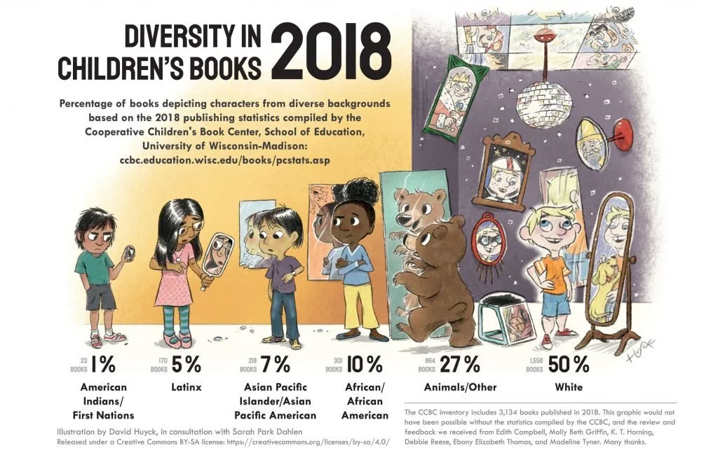
Finally, I want to touch on diversity as I think it's a significant subject that should be addressed. Here is a brilliant picture by Sarah Park Dahlen, an associate professor of MLIS at St. Catherine University and illustrated by David Huyck. Sadly while it is from 2018, little has changed, so it is still essential to address.
I always say that as an illustrator, we are the eyes of the new generation. Children grow up seeing our pictures. Even if you are not a children's book illustrator, this is more than likely true to you in one way or another. If a child cannot see themselves or others like them, then this has enormous implications as they grow up. "When children cannot find themselves reflected in the books they read, or when the images they see are distorted, negative, or laughable, they learn a powerful lesson about how they are devalued in the society of which they are a part." from Mirrors, Windows, and Sliding Glass Doors by Rudine Sims Bishop, 2009.
When drawing a child, try and make sure they are diverse in their race and shape and ability. Aim to not make children form a gender stereotype. They can be genderless, girls with short hair, boys with pink clothing. Here are some other stereotypes to avoid.
• Racial: Making the white character in charge, Asian character passive etc.
• Parental: All parents the same sex and one race.
• Jobs: Police officers all male and white, cleaners all-female and mixed race etc.
• Villains: Making villains look disfigured, darker in colour, ugly or old.
• Age: Making old people look all the same, disabled or grey.
• Clothing: Not putting your characters in a sari or hijab, making all women and men dress the same.
• Toys: Having boys always playing with cars and girls with dolls etc.
This also applies to animal characters, don't always have the mother wearing an apron in the kitchen and the dad at work etc.
TASK: Look at your current portfolio and examine all of these points:
Are all of your characters involved in the image, do they all have an important pose and at least one stand out feature to them?
Are at least 80% of your characters interacting with another character (animal to human counts)?
Are your characters mixed in age, race, ability and gender?


